I love that it is FREE! And after a little playing around you can really make a difference in your pictures. Most pictures if you hit the Auto button it just makes the color a little better. But I have a few pictures that are my favorites that I really wanted to punch it up and make it pop!
The 3 pictures on my side bar I edited with Picnik, and I thought I would share a few more of my before and after pictures.
Before:
After:
Cropped in, straightened out a bit, and played with colors and exposure.
Here are a few more:
This one is one of their effects. Very fun.
They have lots of fonts to play with:
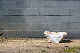
I took Brother for a little photo shoot out at a warehouse near our place the other day. I thought that the blue building would be a neat back drop and the pictures turned out really cute. But it was a really sunny day and the pictures didn't turn out as "blue" as the building really looks in real life.
I used Picnik to create my avatar and banner. I really really LOVE it. And I hope to incorporate it to my blog...when I take the initiative to redo my template and design.


No comments:
Post a Comment